
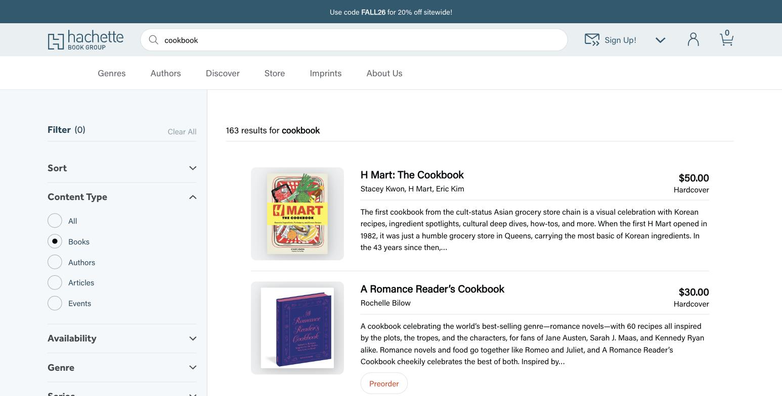
Consolidating titles from every imprint into a single searchable catalog on WordPress, adding direct e-commerce, and giving dozens of imprint editors one block-based design system to work in.
Challenge
Hachette Book Group ranks among the five largest trade publishers in the United States, releasing more than 1,000 titles a year across imprints that span literary and commercial fiction, nonfiction, and books for young readers. Its authors appear regularly on the New York Times bestseller list, and its website serves readers, booksellers, librarians and industry professionals at the same time.
The publisher set out to modernize that digital presence around two goals: bring titles from every imprint into one comprehensive catalog that industry professionals could search, and add e-commerce so readers could buy directly. The existing site worked against both. It was built around auto-playing image carousels that user research showed browsers ignored, and those carousels also degraded performance and cluttered the interface. Dozens of editors maintained individual imprint sites with no shared system for holding the brand together, and the design had drifted into gray tones, all-caps headers and dense grids of book covers that were difficult to scan.
One design system, dozens of imprints
Discovery began with roundtable discussions and surveys covering the publisher’s identity, its competitive position and what its internal teams needed. An inventory of the existing CMS showed which patterns editors actually used and which features could be retired. The result is a block-based design system that holds Hachette Book Group brand standards while giving each imprint room for its own identity.
Editors had been spending significant time curating book lists by hand, so those lists were rebuilt to populate dynamically. The auto-play carousels gave way to horizontal scrolling, and book cover sizing was standardized to reduce visual noise and improve scannability. The gray palette was replaced with a sheer blue drawn from existing brand colors, all-caps headers moved to sentence case, and the 90 degree angles of the Hachette H logo carried through the layout.
Accessibility ran through the work rather than alongside it. Every brand color was translated to meet web accessibility standards, and touch targets were sized for thumbs on mobile devices. A staging environment kept feedback and iterative refinement running throughout development.
Key Stats
+40
Lighthouse desktop performance points gained after launch
+22
Lighthouse mobile accessibility points gained after launch
1,000+
Titles published each year across all imprints
Quote
The redesign of our website was a game changer for us – in terms of the visual cohesiveness, user experience, site performance, and, most importantly, in how the site now aligns with our strategic goals.
– Wibke Grütjen, Vice President and Chief Marketing Officer, Hachette Book Group